How to create a Drupal 8 Toolbar Icon
Have you installed Drupal 8 yet? That toolbar is an incredible piece of art. It's functional, beautiful, and really slick. The icons are resolution independent, so that means your average mobile phone and some of the higher end laptops can show off a lot more icon detail. It's so pretty, it's just begging to be extended and filled with all the awesome-sauce that is Drupal Commerce.
Below is a journey through making a toolbar icon happen on Drupal 8-alpha6. Note that things can definitely change between now and a stable Drupal 8.
D8 Toolbar Status
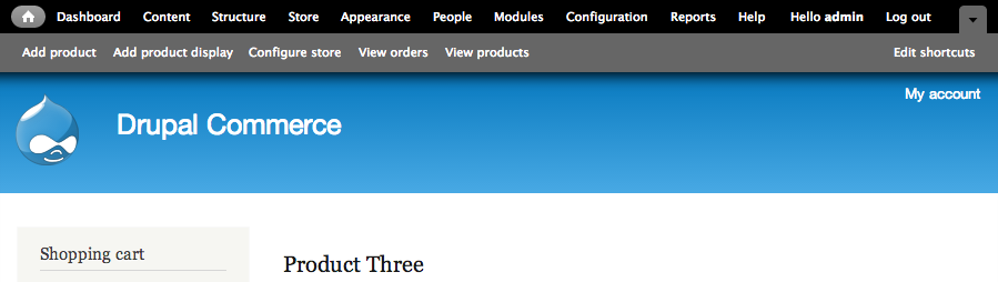
So, unless you were in the issue queues helping make decisions and solve problems, you've likely not taken much time to follow the evolution of the toolbar. In Drupal 7, this is the toolbar you get:
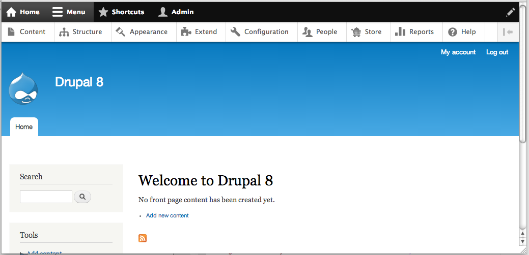
And in Drupal 8, you get so much more:
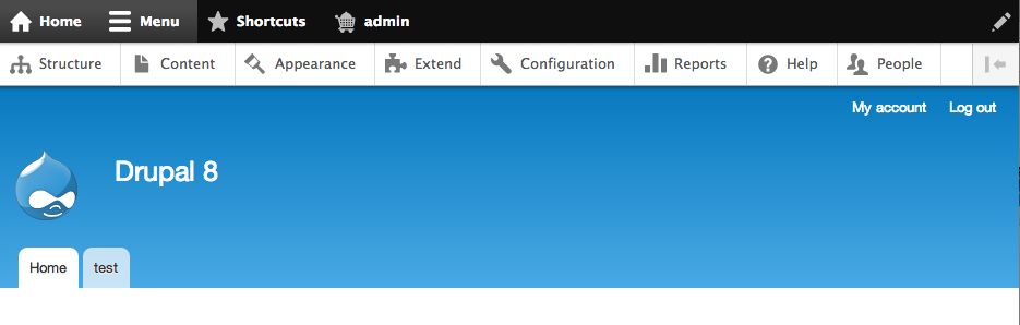
- Toolbar Bar - This is the black bar across the top. Yes it's called the "Toolbar Bar" (note the double "bar"). In a particularly brilliant stroke, we have four very simple actions. The clutter is gone. And the best part? The links collapse into icons on smaller screens.
- Toolbar Tray - This is the white bar just below the black bar that can go "horizontal" using a toggle switch. Unlike Drupal 7, the top bar items tie directly to the second bar. I, for one, am very impressed with how comfortable this tray feels. Finally, Drupal has a world-class toolbar.
- Toolbar Tray expansion - When in a horizontal view, you can click the icon to the far right and make it go vertical. Once vertical, you can expand and collapse whole sets of links. So we no longer have page load after page load if you know where you're headed.
- Icons - Notice all those icons? They're a new feature and that's the focus of the rest of this article. Lots to talk about.
Icons with Drupal 8's Toolbar
Before jumping into creating an icon, let’s look at how icons are used in Drupal 8’s fancy new toolbar. All the available icons are in this folder:
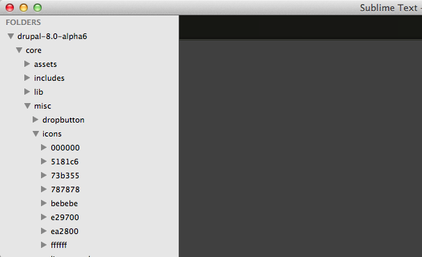
Did you notice that all the folders in the icons are hexadecimal colors? Remember, we’re not using an icon font, so changing their color in CSS is a non-starter. But it’s a small price to pay for having a system that only needs to load specific images vs. a font-per-module.
So, before you decide which colors you need to produce, it's helpful to have a simple table that walks us through all the different color possibilities that comes with Drupal 8. You will always want to try to follow core as best practice, so it stands to reason you'll need to include some of these colors by default. At the very least, you'll want to include the top four in this list as they are the colors used in the toolbar bar and tray extensively:
| Color | Use Case | CSS Example |
|---|---|---|
|
#bebebe
|
Toolbar Bar: Default | contextual.icons.css (line 9) |
|
#ffffff
|
Toolbar Bar: Active | user.icons.css (line 9) |
|
#787878
|
Toolbar Tray: Default | contextual.icons.css (line 43) |
|
#000000
|
Toolbar Tray: Active | toolbar.icons.css (line 120) |
|
#5181c6
|
Toolbar Tray: Blue arrow | toolbar.icons.css (line 284) |
|
#73b355
|
Status: Success | system.theme.css (line 539) |
|
#e29700
|
Status: Warning | dblog.module.css (line 47) |
|
#ea2800
|
Status: Emergency/Error | system.admin.css (line 213) |
So, if we’re going to create an icon, best practice includes exporting an icon per-color and adding these icons in a misc/icons folder for your module.
After a quick discussion with jessebeach on #drupal-contribute, I looked at the user and shortcut module for an implementation use case. The following example is from the user module:
/**
 * @file
 * Styling for the user module icons.
 */

/**
 * Toolbar tab icon.
 */
.toolbar-bar .toolbar-icon-user:before {
  background-image: url("../../../misc/icons/bebebe/person.svg");
}
.no-svg .toolbar-bar .toolbar-icon-user:before {
  background-image: url("../../../misc/icons/bebebe/person.png");
}
.toolbar-bar .toolbar-icon-user:active:before,
.toolbar-bar .toolbar-icon-user.active:before {
  background-image: url("../../../misc/icons/ffffff/person.svg");
}
.no-svg .toolbar-bar .toolbar-icon-user:active:before,
.no-svg .toolbar-bar .toolbar-icon-user.active:before {
  background-image: url("../../../misc/icons/ffffff/person.png");
}
So here's our first real code example implementing the CSS for the toolbar icons:
/**
 * @file
 * Styling for Commerce toolbar icons.
 */

/* Bar formatting, not implemented, but we may want this in the future. */
.toolbar-bar .toolbar-icon-store:before {
  background-image: url("../icons/bebebe/drupal-cart.svg");
}
.no-svg .toolbar-bar .toolbar-icon-store:before {
  background-image: url("../icons/bebebe/drupal-cart.png");
}
.toolbar-bar .toolbar-icon-store:active:before,
.toolbar-bar .toolbar-icon-store.active:before {
  background-image: url("../icons/ffffff/drupal-cart.svg");
}
.no-svg .toolbar-bar .toolbar-icon-store:active:before,
.no-svg .toolbar-bar .toolbar-icon-store.active:before {
  background-image: url("../icons/ffffff/drupal-cart.png");
}


/* Tray formatting, shown in screenshots. */
.toolbar-tray .toolbar-icon-store:before {
  background-image: url("../icons/787878/drupal-cart.svg");
}
.no-svg .toolbar-tray .toolbar-icon-store:before {
  background-image: url("../icons/787878/drupal-cart.png");
}
.toolbar-tray .toolbar-icon-store:active:before,
.toolbar-tray .toolbar-icon-store.active:before {
  background-image: url("../icons/000000/drupal-cart.svg");
}
.no-svg .toolbar-tray .toolbar-icon-store:active:before,
.no-svg .toolbar-tray .toolbar-icon-store.active:before {
  background-image: url("../icons/000000/drupal-cart.png");
}
Creating a Toolbar item
CSS and JS are no longer simply added to your .info file (see change notice). Instead, we need to create a library. This part of the code may change as it seems odd that we are using a configuration array instead of a yaml file, but time will tell.
<?php
/**
 * Implements hook_library_info().
 */
function commerce_library_info() {
  $libraries = array();

  $libraries['commerce.icons'] = array(
    'title' => 'Commerce icon styling',
    'version' => '0.1',
    'css' => array(
      drupal_get_path('module', 'commerce') . '/css/commerce.icons.css' => array(),
    ),
  );

  return $libraries;
}
?>
After you are done defining the library, you need to attach the library to the toolbar using "hook_toolbar()." This approach means your library will only load those icons when the toolbar is loaded and not on every single page. No reason for your homepage to cache the CSS for this!
<?php
/**
 * Implements hook_toolbar().
 */
function commerce_toolbar(&$items) {
  $items = array();

  $items['commerce'] = array(
    '#type' => 'toolbar_item',
    '#attached' => array(
      'library' => array(
        array('commerce', 'commerce.icons'),
      ),
    ),
  );

  return $items;
}
?>
Steps to creating your own icons
The final step is to actually create some files we can use with our new menu item and that uses the CSS.
1) Get some icons to look at
The current set of icons in Drupal 8 are actually a third-party library called "Libricons." Go ahead and make a fork of Libricons and then clone it to your desktop (or just download the zip file and extract it to your folder of choice).
2) Set up your editor and make an icon
Open up the star or the house icon (big icons that give you a good idea of scale) and set up your document to use points (Illustrator CS5 defaults to inches) and then show your grid lines, one every 1 pt, subdivided by 4.
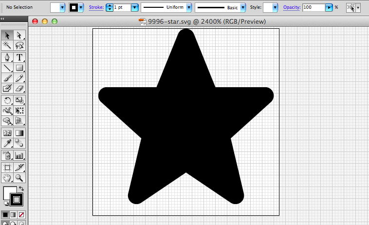
The screenshot above is what this looks like in Adobe Illustrator CS5. IcoMoon has some great tips on how to create an SVG file that works well: http://icomoon.io/docs.html
Also, you want to make sure the vector you are creating will look good at 20px. That's the fixed-width of the toolbar icons. We're actually optimizing for 16px or 32px according to Libricons. To get an idea of what "optimizing" looks like, here's an example of what our standard cart looked like and what we had to do to translate this to a smaller resolution:
Use IcoMoon to generate the SVG and colors
Next, you'll want to enable the IcoMoon app on your favorite Chrome browser. This is the process recommended by Libricons.
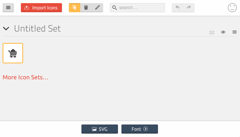
You just need to upload your new icon to IcoMoon, follow the Libricon's detailed instructions (including setting up the custom x height), and click on the "SVG" button.
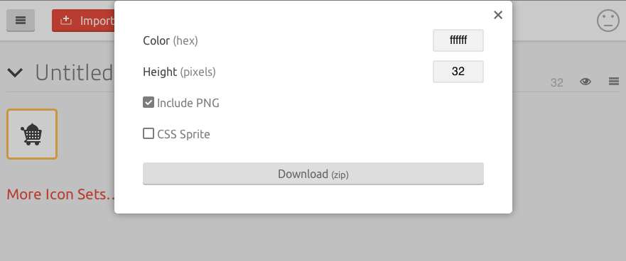
For color codes, you can simply use the table reference above and download versions in each color you need.
End Result
So that's how the Drupal Commerce cart got added to the Drupal 8 toolbar. Hopefully this blog post helps others extend and enjoy the Drupal 8 toolbar! PS: If you want to participate in bringing Drupal Commerce over the Drupal 8, we're still asking for feedback on the roadmap.

Comments
Will this icon be added to
Will this icon be added to the Drupal 7 navbar, or do you need to do it yourself?
This icon is for D8, not D7 :
This icon is for D8, not D7 :)
Josh
Awesome writeup, thanks Josh!
Awesome writeup, thanks Josh!
Isolesen, the Navbar in D7 works in the same way as the D8 Toolbar. I've tried to keep the codebases as in-sync as possible, so Josh's writeup here should apply equally well to creating icons for the Navbar.
Ha! https://drupal.org
Ha! https://drupal.org/project/navbar is news to me ...
D7 vs. D8 admin menu style
Many thanks for your article! Very glad to hear about customization options.
Don´t get me wrong, it seems to be a great feature to customize and theme it.
I really do appreciate all the time effort for D8 and responsive admin menu!
But to be honest, it is not "pretty", nor "sleek". In my humble opinion, the current D8 default style is not finished, yet. That applies to the icons and the overall appearance. It looks somewhat "un-professional" and "undecided" (can't explain it any better in english, sorry). I am aware of the "bigger appearance" for touch displays etc., but as a default on larger screens, it makes no sense to me. The D7 version looks sleek, IMHO. Hopefully, the style is going to be polished and overhauled.
My first impressions and thougths:
- icons to large compared with text (if both is displayed, it should create a unison)
- icon and text should have the same color
- two different colors make sense in a vertical orientation, where the icon is dominant on top, and the text is just a small additional hint (i.e. subline)
- not sure about the high contrast of the upper row and second menu bar (D7 is better, because of the same text color, IMHO)
- default sizes on larger screens could be smaller, Appearance could adapt to devices i.e. big icons only on mobile devices etc.
Anyway, many things might be personal preference, but some basic GUI design rules should be considered. I am really looking forward to D8 and the new navbar features. Maybe this will end-up in a colorful style/theme competition ;-)
Happy drupaling!