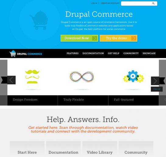
Welcome to the new DrupalCommerce.org!

We launched the new DrupalCommerce.org in the wee hours of the morning after a marathon migration sprint. As I mentioned before, the old site was created on Drupal 6 in late 2009 and was minimally maintained as a community forum. We always wanted to build a much more intentional user self-help community, but we were limited by the technology we were running.
The new site was built from scratch on Drupal 7 to give us a much more flexible foundation. Aaron Dudenhofer implemented the design you see as an Omega subtheme, and I built many of the features while Kris Vanderwater figured out how to use the Migrate module to move old content into the new systems.
There's still more content to flesh out and a little site building to be done, but let's take a quick look at the most prominent new features:
- Features carousel and listing. The front page now prominently displays some of the greatest things about using Drupal Commerce to build an eCommerce site. As opposed to a mile long feature list, we're focusing on categories of features and guiding principles of the project to put our best face forward to folks evaluating Drupal and Drupal Commerce for the first time.
- Simplified documentation browsing. We basically condensed everything into the User Guide and Developer Guide that used to be spread out in a couple other handbooks. Josh Miller is hard at work completely revamping the User Guide to provide complete documentation of Drupal Commerce core, including step-by-step tutorials with screenshots.
- New Commerce Q&A system. Even though they were never billed as such, the previous forums were full of support requests - but they weren't particularly suited to the task. In our new Commerce Q&A system, we're growing a better self-help community around collaboratively maintaining and curating questions and their best answers. Eventually the entire FAQ handbook will be ported to this system under the FAQ tag. With the opening of this system, we are no longer accepting support request issues in the project issue tracker on drupal.org.
- Simplified discussion board. The old forum threads were migrated to a single, simplified discussion board where new discussion topics can be opened. We'll have to manually migrate questions and answers from this board to the Commerce Q&A, but our hope is that the discussion board can actually be used for broader discussions about the direction and development of Drupal Commerce, its contributed modules, and community events.
- Better curated showcase. The old showcase was little more than a wiki with bare minimum descriptions of sites, no screenshots, and dead links. Our goal for the new site is to highlight more prominently the most interesting sites built using Drupal Commerce, giving special attention to sites with attractive designs, unique feature sets, and technical write-ups describing the build process. While we sort out how to manage regular listings, showcase requests can be added through the project's issue tracker. After all, we still want developers to share their latest sites, even if they don't have time to write about them!
Don't be surprised to see continual updates to the site and theme in the coming weeks as we figure out how to best enable users to find the information they're looking for on DrupalCommerce.org. In the end, we really want this site to serve the community and foster the growth of the Drupal Commerce project as a whole.


Comments
Friendly & Eye Pleasing UI
I love this new awesome UI of Drupal Commerce. It's not only eye pleasing but also very simple to use interface. Best of all is your help section. Thumbs up for Drupal Commerce.
Thanks a lot! So glad to hear
Thanks a lot! So glad to hear, and I sure hope the Commerce Q&A really works well for the community. : )
Looks good
I like the question and answer format. I will be using it!
Wonderful! Can't wait to see
Wonderful! Can't wait to see you tearin' it up, Joe. : )
Omega++ Yay!
Site redesign looks fantastic! Thank you for all the work you are doing to make commerce in Drupal so simple and effective. Drupal Commerce is absolutely essential to any business seriously considering using their website to sell goods and services. For developers, DC is a dream. Thank you, thank you, thank you!
Love it!
Mucho improved, well done! Design looks fantastic, finding the body text pretty hard to read though (Museo always renders pants on Vista!).
Hopefully I'll be filling up some of that showcase section pretty soon!
Font is a problem
I too am finding the body text font very very difficult to read. It looks very thready as if the solid lines of the letters are not solid.
Chrome on XP here.
Screenshot
Here's a screenshot of how it looks to me - http://dl.dropbox.com/u/30168897/Drupal%20Commerce%20Text.png
Strangely the isolated text in the screenshot image seems slightly clearer than actual text in the browser.
Congrats on the relaunch :)
Congrats on the relaunch :)
Having a look around so can't comment on the reorganisation as such but I am also finding the colour scheme and font a problem.